In this section, we will DRY up our code by using reusable Blade components
Blade components allow us to follow the DRY or “Don’t Repeat Yourself” principle which means that we can reuse the component anywhere in our application
In a previous chapter we were already introduced to (static) Blade components, but now we are going to make them dynamic
Laravel has two types of components:
components with a dedicated class: e.g. the layout component
components without a class (anonymous components): e.g. the navigation and footer in the layout
In this chapter we generate some anonymous components that we will use later in the course
REMARKS
Anonymous components MUST be placed inside the resources/views/components folder and be rendered with the x- prefix, followed by the
path and name of the Blade file
The path and name are separated by a dot
When an index.blade.php file exists for the component, it will be rendered as the "root" node of the component
component
Render
resources/views/components/list.blade.php
<x-list>
resources/views/components/list/index.blade.php
<x-list>
resources/views/components/alert.blade.php
<x-alert>
resources/views/components/alert/index.blade.php
<x-alert>
resources/views/components/alert/icon.blade.php
<x-alert.icon>
We create our components in a subfolder resources/views/components/tmk (Thomas More Kempen 😉) so that we can be sure that they will not be overwritten if you later install any online component libraries
TIP
Create a (temporary) playground page (resources/views/playground.blade.php) that we can use to test our components
Create a route to the playground page in routes/web.php
You may specify which attributes should be considered data variables or properties (instead of 'normal' attributes) using the @props directive at the top of the component
Properties also can have default values
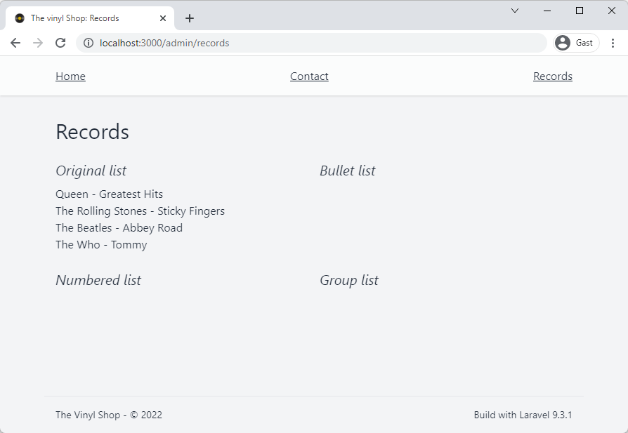
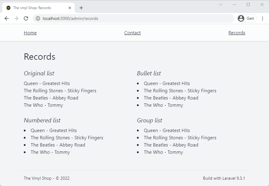
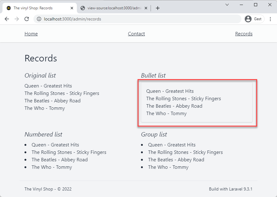
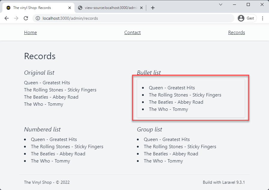
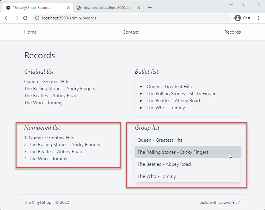
Let's add a type property to specify the layout of the list
The type property can have the value:
ul: rendered as a numbered list (default value)
ol: rendered as a bullet list
group: rendered as a grouped list
Line 3 and 11: add the type property to the last two list components
Line 11 and 13: add some additional classes group list and to the list-items inside the groups list
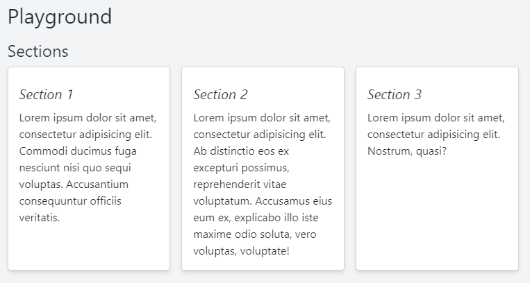
Let's create a component that renders a section with a white background, a tiny border and a drop shadow
This component is very simple, because it only contains a $slot and some basic styling
Create a new section component inside the components folder: resources/views/components/tmk/section.blade.php
Open resources/views/playground.blade.php and add three sections to the page
<x-slot name="title">Playground</x-slot><h2>Sections</h2><div class="grid grid-cols-3 gap-4"><x-tmk.section class="col-span-3 md:col-span-1"><h3>Section 1</h3><p>Lorem ipsum dolor sit amet, consectetur adipisicing elit. Commodi ducimus fuga nesciunt nisi quo sequi
voluptas. Accusantium consequuntur officiis veritatis.</p></x-tmk.section><x-tmk.section class="col-span-3 md:col-span-1"><h3>Section 2</h3><p>Lorem ipsum dolor sit amet, consectetur adipisicing elit. Ab distinctio eos ex excepturi possimus, reprehenderit vitae voluptatum. Accusamus eius eum ex, explicabo illo iste maxime odio soluta, vero voluptas, voluptate!</p></x-tmk.section><x-tmk.section class="col-span-3 md:col-span-1"><h3>Section 3</h3><p>Lorem ipsum dolor sit amet, consectetur adipisicing elit. Nostrum, quasi?</p></x-tmk.section></div>
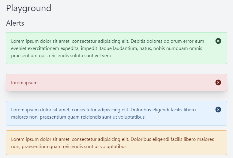
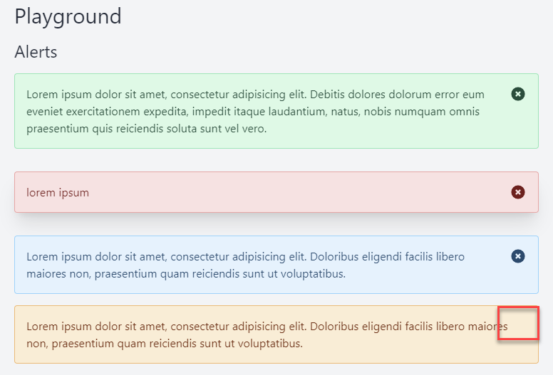
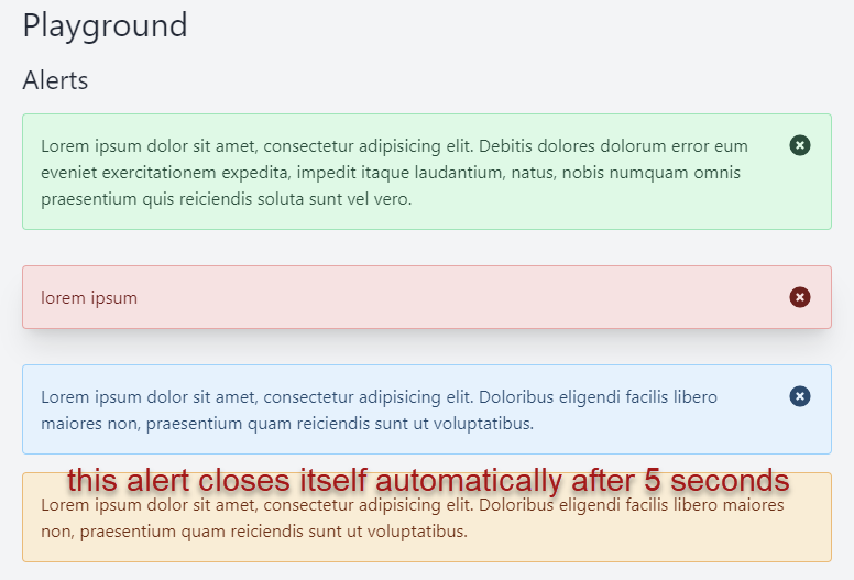
<x-slot name="title">Playground</x-slot><section class="my-4"><h2>Alerts</h2><x-tmk.alert>
Lorem ipsum dolor sit amet, consectetur adipisicing elit. Debitis dolores dolorum error eum eveniet
exercitationem expedita, impedit itaque laudantium, natus, nobis numquam omnis praesentium quis reiciendis
soluta sunt vel vero.</x-tmk.alert><x-tmk.alert type="danger"class="mt-8 shadow-xl">
lorem ipsum
</x-tmk.alert><x-tmk.alert type="info"class="mt-8">
Lorem ipsum dolor sit amet, consectetur adipisicing elit. Doloribus eligendi facilis libero maiores non,
praesentium quam reiciendis sunt ut voluptatibus.</x-tmk.alert><x-tmk.alert type="warning" dismissible="false" close-self="5000">
Lorem ipsum dolor sit amet, consectetur adipisicing elit. Doloribus eligendi facilis libero maiores non,
praesentium quam reiciendis sunt ut voluptatibus.</x-tmk.alert></section>
Line 6 - 8: wrap the x-init Alpine directive in a if statement to check if the closeSelf property (the time in ms after the component will close itself ) is greater than 0
Line 7: x-init(opens new window) initializes a setTimeout function that will close the alert after closeSelf milliseconds
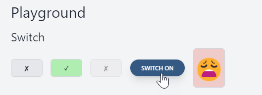
The switch component is a toggle component that can be used to replace a regular checkbox
Because the default attributes for a checkbox (name, value, disabled, etc) must be moved from the root element of the component (label) to the nested input tag,
you must pass the attributes to the switch component as props
The switch component has the following properties:
Property
default
description
checked
false
whether the checkbox is checked or not
disabled
false
whether the checkbox is disabled or not
name
null
the name of the checkbox
value
null
the value of the checkbox
colorOff
bg-gray-200
the background color when the checkbox is not checked
colorOn
bg-green-200
the background color when the checkbox is checked
textOff
✘
the text inside the switch when the checkbox is not checked
textOn
✓
the text inside the switch when the checkbox is checked
Create a new switch component inside the components folder: resources/views/components/tmk/form/switch.blade.php
Open resources/views/playground.blade.php and add four switch variants to the page
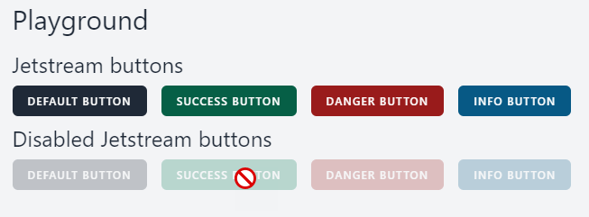
Jetstream components are a set of components that are built on top of the Jetstream(opens new window) package that we us
later in this course for authentication
After publishing the component, you can use them in your own Blade files and you can eventually change them to your liking
Open the terminal and run the command php artisan vendor:publish --tag=jetstream-views
The Jetstream components are stored inside the resources/views/vendor/jetstream/components directory
All the Jetstream components have their own <x-jet-...> prefix
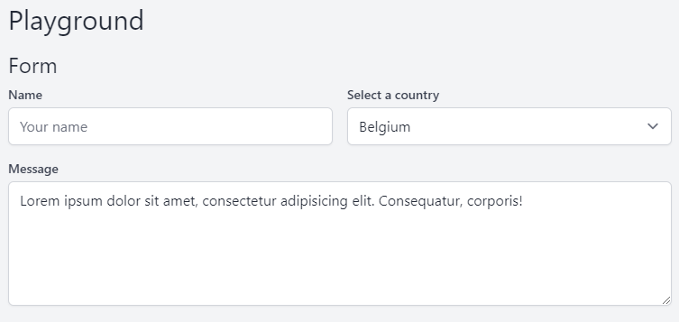
Jetstream has a lot of form-related components (input, button, error message, ...), but two of them are missing:
a select component
a textarea component
We create these components ourselves, but based on the input component so we have the same look and feel for every element in a form
Copy the code from resources/views/vendor/jetstream/components/input.blade.php
Paste the code in the resources/views/components/tmk/form/textarea.blade.php
Line 3: change <input ....> to <textarea ...>, close the </textarea> tag and add a default slot inside the <textarea> tag
IMPORTANT: place the code on one line, otherwise the component contains a return as a default value and, if you set a placeholder attribute, it will not be displayed!
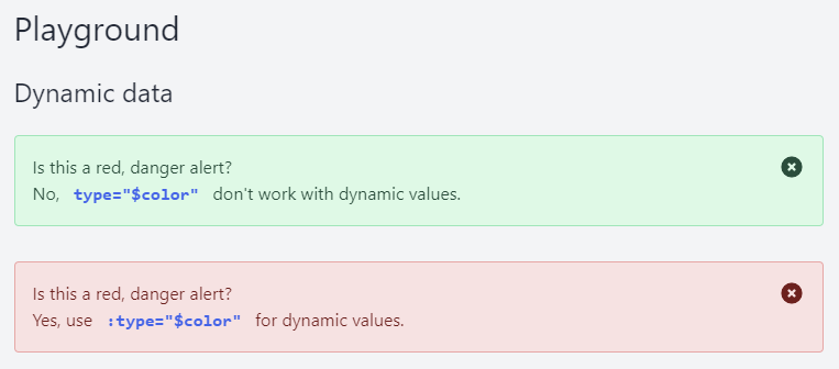
Hard coded, string values may be passed to the component using simple HTML attribute strings
You can also pass a dynamic values to the component, but than you have to prefix the attribute with :
Open resources/views/playground.blade.php and add two alerts to the page
<x-slot name="title">Playground</x-slot><section class="flex flex-col"><h2>Dynamic data</h2>
@php
$color='danger';
@endphp
<x-tmk.alert type="$color">
Is this a red, danger alert?<br>
No,<code class="px-2 text-blue-600 font-black">type="$color"</code> don't work with dynamic values.</x-tmk.alert><x-tmk.alert :type="$color">
Is this a red, danger alert?<br>
Yes,use<code class="px-2 text-blue-600 font-black">:type="$color"</code>for dynamic values.</x-tmk.alert></section>